
insights: 101 Calibri Font Family
Calibri Font Family: History, Features, and Why It Became So Popular
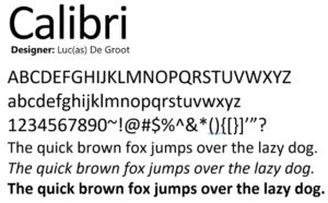
Calibri is the most popular and default font on Microsoft Office. It is a sans-serif typeface created by Dutch designer Luc(as) de Groot between 2002 and 2004. Microsoft officially released it in 2007 with Windows Vista and Microsoft Office 2007. Calibri quickly replaced Times New Roman as the default font in many Office applications and became one of the most widely used modern fonts.
Calibri is known for its clean, soft, and warm look, making it suitable for both digital screens and printed documents. Calibri was selected as the default typeface for Microsoft Word, PowerPoint, Excel, Outlook, and WordPad. The primary reason is that its smooth curves and rounded corners provide better readability compared to older fonts like Times New Roman and Arial.
ClearType Technology
Calibri is part of Microsoft’s ClearType Font Collection, a special group of fonts designed to improve text readability on LCD and LED screens. All fonts in this collection start with the letter “C”, which represents their connection to ClearType technology.
Other ClearType Fonts Include:
- Cambria (serif)
- Candara (sans-serif)
- Consolas (monospace)
- Constantia (serif)
- Corbel (sans-serif)
Features of the Calibri Font Family
Modern Sans-Serif Look
The rounded edges and simple structure give it a friendly and professional appearance.
High Readability
Optimized for ClearType, Calibri looks sharp on monitors, laptops, and mobile screens.
Versatile Use
It works well for:
- Office documents
- Presentations
- Emails
- Websites
- Academic papers
Multiple Styles
Calibri includes different font weights:
- Regular
- Italic
- Bold
- Bold Italic
Where Calibri Is Commonly Used
To date, Calibri has also been the most used Font, and people mostly use it for the following purposes:
- Business letters
- Resumes and CVs
- School assignments
- Social media graphics
- Print designs
Why Designers Like Calibri
Even Graphic designers and typographers prefer Calibri because of its unique properties like:
- It supports many languages
- It scales well on all resolutions
- It maintains clarity even at small sizes
- It offers a balanced and elegant look
Calibri vs. Other Fonts
| Font Name | Type | Best For | Characteristics |
|---|---|---|---|
| Calibri | Sans-serif | Digital documents | Soft, modern, warm |
| Arial | Sans-serif | Web & basic text | Simple, neutral |
| Times New Roman | Serif | Formal writing | Traditional, serious |
| Cambria | Serif | Academic & print | Sharp, clear for reading |
Conclusion
Calibri is more than just a default Microsoft font. it’s a modern, readable, and versatile typeface with a strong design history. It features ClearType optimization, a clean design, and widespread availability, making it a favorite for students, professionals, and creators worldwide. If you’re looking for a professional and friendly font, Calibri is still one of the best choices.
Thank you for visiting Calibri Font.
Also read:
Download Nepali Font | 500 + Fonts Collection